Create Custom Reports for Toast POS
Last updated: May 5, 2026, 10:13 AM
Learn how to set up custom reports in Toast Web.
- Custom Reports for Toast POS Overview
- Create Your First Custom Report With a Toast Template
- Create Your First Custom Report From Scratch
- Widget Examples
Custom Reports for Toast POS Overview
Custom reports allow you to build flexible, interactive dashboards that keep your most-used reports in one place. Within your custom reports dashboard, you can create table and chart widgets, rearrange them as needed for easy viewing, and compare data across timeframes and locations, all without exporting to external spreadsheets.
To access custom reports in Toast Web, navigate to Reports > Custom reports.
Once created, all saved custom reports will live within this page.
Here is a video walkthrough of Toast's Custom Reports.
Create Your First Custom Report With a Toast Template
To begin creating your custom report using a Toast template in the Custom Reports builder, select the Create new report button.
Next, select a Toast-created template by hovering over the template you’re interested in. Here you can either select Preview to preview the template, or select Use this template to get started on customization.
Within the template library, you will have the following options to help you get started:
- Daily sales
- Prep station performance
- Location trends
- FOH scorecard
- Fulfillment time by item
- Item sales by employee
- Sales deep dive
- Discount breakdown
- Gift card performance
- Hourly sales
- Menu breakdown
- Sales trend charts
Once your report template has been generated, you can hover over the title and select the pencil icon to change the name for your report. If you select a widget, you will see the following menu while in edit mode:
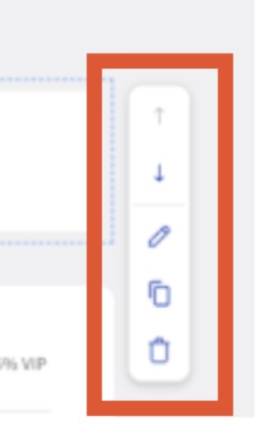
The arrows allow you to move the widget up and down throughout your dashboard, the pencil icon allows you to edit the filters in your chart, table, or metric highlight, the double rectangle allows you to duplicate the widget, and the trashcan allows you to delete the widget.
When you have everything where you want it, select Save.
Create Your First Custom Report From Scratch
To begin creating your custom report from scratch:
- In the Custom Reports builder, select the Create new report button.
- Select Start from scratch.
- Add reporting widgets to your report by dragging and dropping them into your custom report sections. You can select from the following widget types:
- Table: Displays data in rows and columns and allows you to select multiple metrics. Use this widget type when you want detailed, row-by-row data (e.g. discounts, items sold, etc.). You will need to configure the following:
- Table name
- Primary breakdown: Select the primary dimension to use to group your data from drop down.
- Secondary breakdown (optional): Add a secondary dimension for more detailed grouping.
- Metrics: Scroll through the list of available metrics or use the search bar to locate the metric you have in mind.
- Filters: Select criteria to limit which data is included.
- Note: For the time being you can only apply three filter types at a time (e.g., Day of week, Revenue center, Employees).
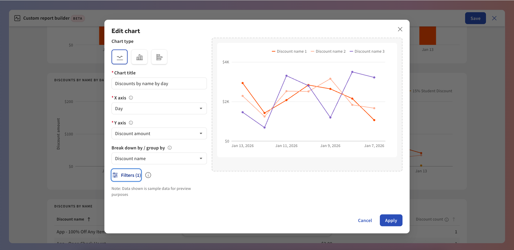
- Chart: Displays data within a bar or line graph. Use this widget type when you want to visualize performance trends or comparisons. For more information, see the Set Up Your Chart Widget section below. You will need to configure the following:
- Chart title
- X axis - Primary breakdown: Choose how to group your data along the horizontal axis, such as by hour, day of week, or date.
- Y axis: Select the metric to measure. Scroll through the list of available metrics or use the search bar to locate the metric you have in mind.
- [Line chart only] Break down by / group by (optional): Add a secondary breakdown to compare values within each primary breakdown, like showing top employees within each hour.
- Filters: Select criteria to limit which data is included.
- Note: You can only apply three filter types at a time (e.g., Day of week, Revenue center, Employees).
- Chart type: Line chart, Vertical bar chart, Horizontal bar chart
- Metric Highlights: Displays key performance indicators. This is helpful for information your team reviews regularly. For more information, see the Metric Highlights Widget section below.
- Table: Displays data in rows and columns and allows you to select multiple metrics. Use this widget type when you want detailed, row-by-row data (e.g. discounts, items sold, etc.). You will need to configure the following:
- Select Save.
Note: You can also move around your custom widgets as mentioned in the Create Your First Custom Report with a Toast Template section above. Custom reports automatically save while you edit, but selecting save will confirm your final layout.
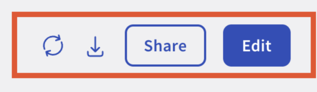
After saving your report, you will be redirected to the finalized report in View mode. In View mode you can:
- Filter by date
- Compare time periods
- Filter by location(s)
- Refresh data
- Download as CSV or Excel
- Share the report
- Edit the report
Custom Report Widget Examples
Table Widget
Below is an example of a table showing the number of discounts by employee name over time:
- Table title: Discounts breakdown
- Primary breakdown: Discount Name
- Secondary breakdown: Employee
- Metric: Discount amount, discount count
- Filters: Day of week - Tuesday, Wednesday
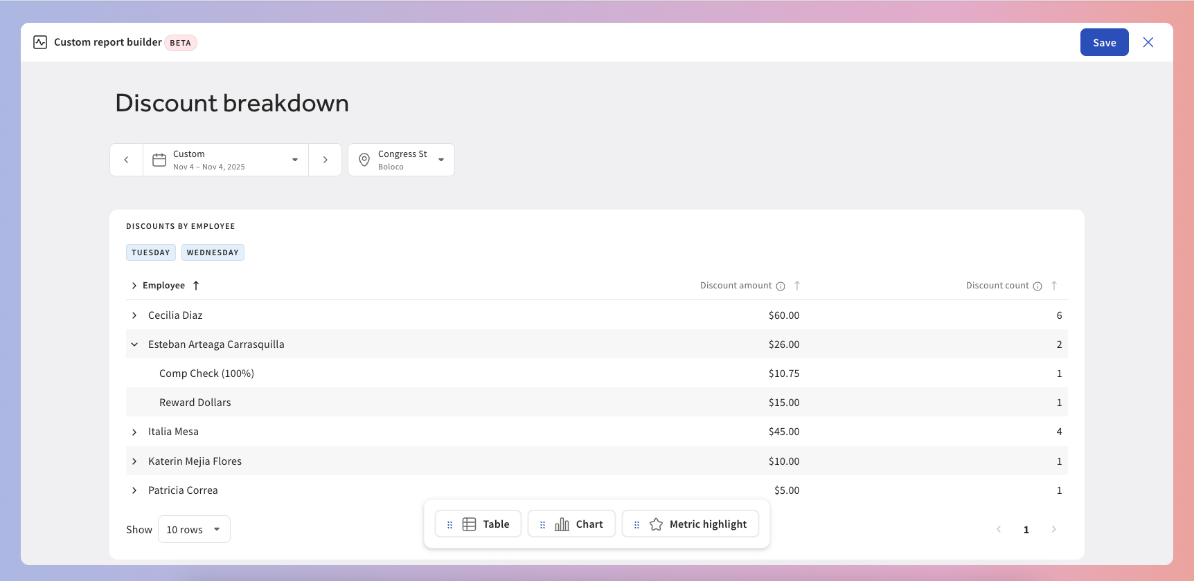
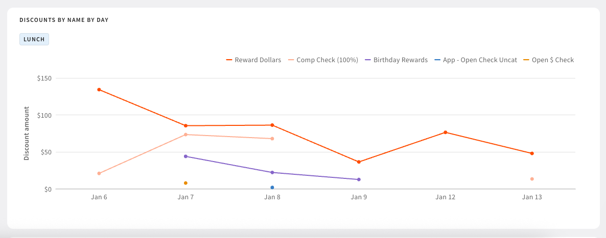
Chart Widget
Below is an example of a chart showing the number of discounts by name by day:
- Chart Type: Line graph
- Chart title: Discounts by name by day
- X-axis - Primary breakdown: Day
- Y-axis: Discount count
- Break down by / group by: Discount name
- Filters: Service - Lunch
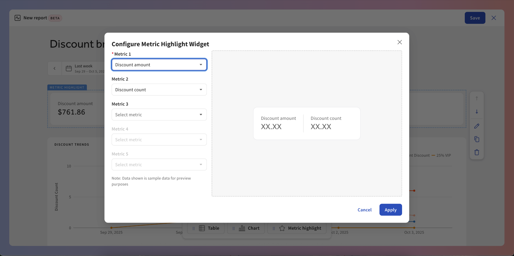
Metric Highlight Widget
Below is an example of a metric highlight showing the total discounts for the time period:
- Metric 1: Discount amount
- Metric 2: Discount count