xtraCHEF: Get Started With Spending by Category Analytics
Last updated: Apr 28, 2026, 4:19 PM
Spending by Category Summary
Want to get a bird's eye view of how you are spending in certain areas (or across multiple locations)? Your Spending by Category analytics can help you quickly visualize where and how you spend across categories. If you want to get the most out of spending by category reporting, consider reading xtraCHEF: Custom Categories to learn about using categories to your advantage in xtraCHEF reporting.
To access your Spending by Category analytics, first, navigate to the Reporting page and select the Spending by Category report. This will display a bar chart with all of your active categories.
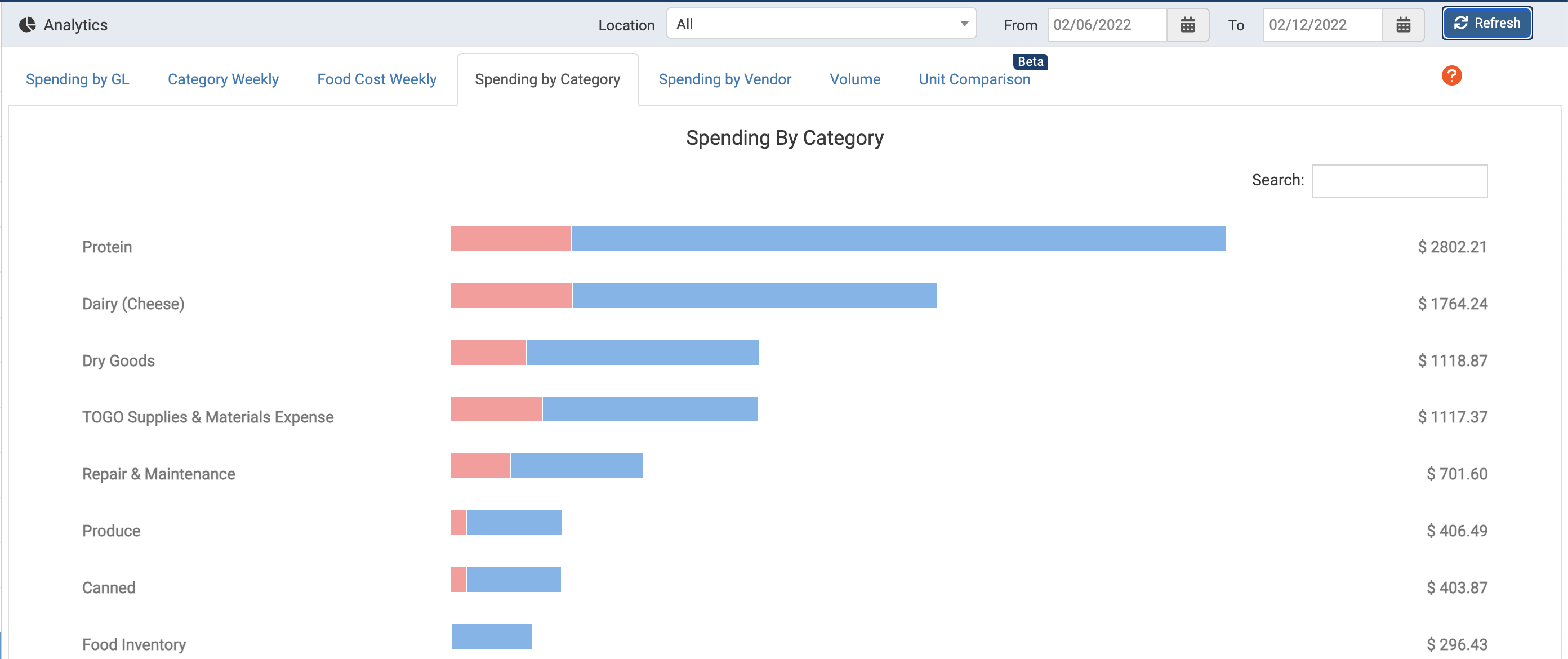
View Spending by Category
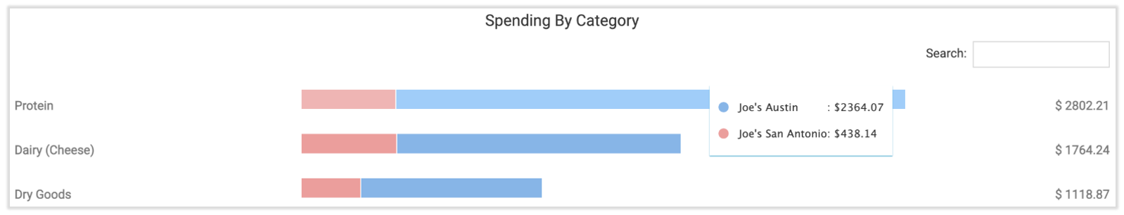
It's important to note that this bar chart will default to all locations and the most recent calendar week. However, you can make adjustments to the location and date range as needed. Once you have adjusted your viewing criteria, select Refresh.

Each bar in your Spending by Category bar graph will let you know how much each location contributes to your overall category spend. To the far right of each category bar, you'll also see the total cost for your date range. Hover over the bar to reveal the spend per location.