xtraCHEF: Get Started With Spending by GL Analytics
Last updated: Apr 28, 2026, 4:19 PM
Spending by GL Overview
General ledger (GL) codes allow your organization to quickly enter and calculate your spending in specific areas such as utilities, food, and more. Your Spending by GL analytics gives you at-a-glance and granular data on how your spending is distributed across a certain location. In this article, we'll explore how to access your spending by GL analytics and where to find the information you need to monitor and control your operating costs.
To access your Spending by GL analytics page, navigate to Reports on the left side of xtraCHEF. Scroll to the Cost visualization section and select Spending by GL.
This tab provides two ways to view your data: a pie chart or table (located under the pie chart). Both options display the same information, so choose the version that works best for you.
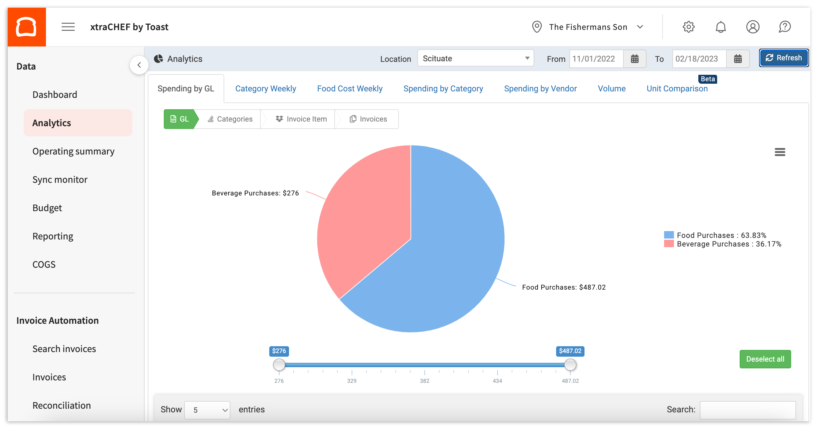
Analytics will default to the most recent calendar week unless you've selected another week's start date (such as Monday-Monday) in your tenant configuration. To customize your data, select your location and date range from the bar at the top of the page, then select Refresh.
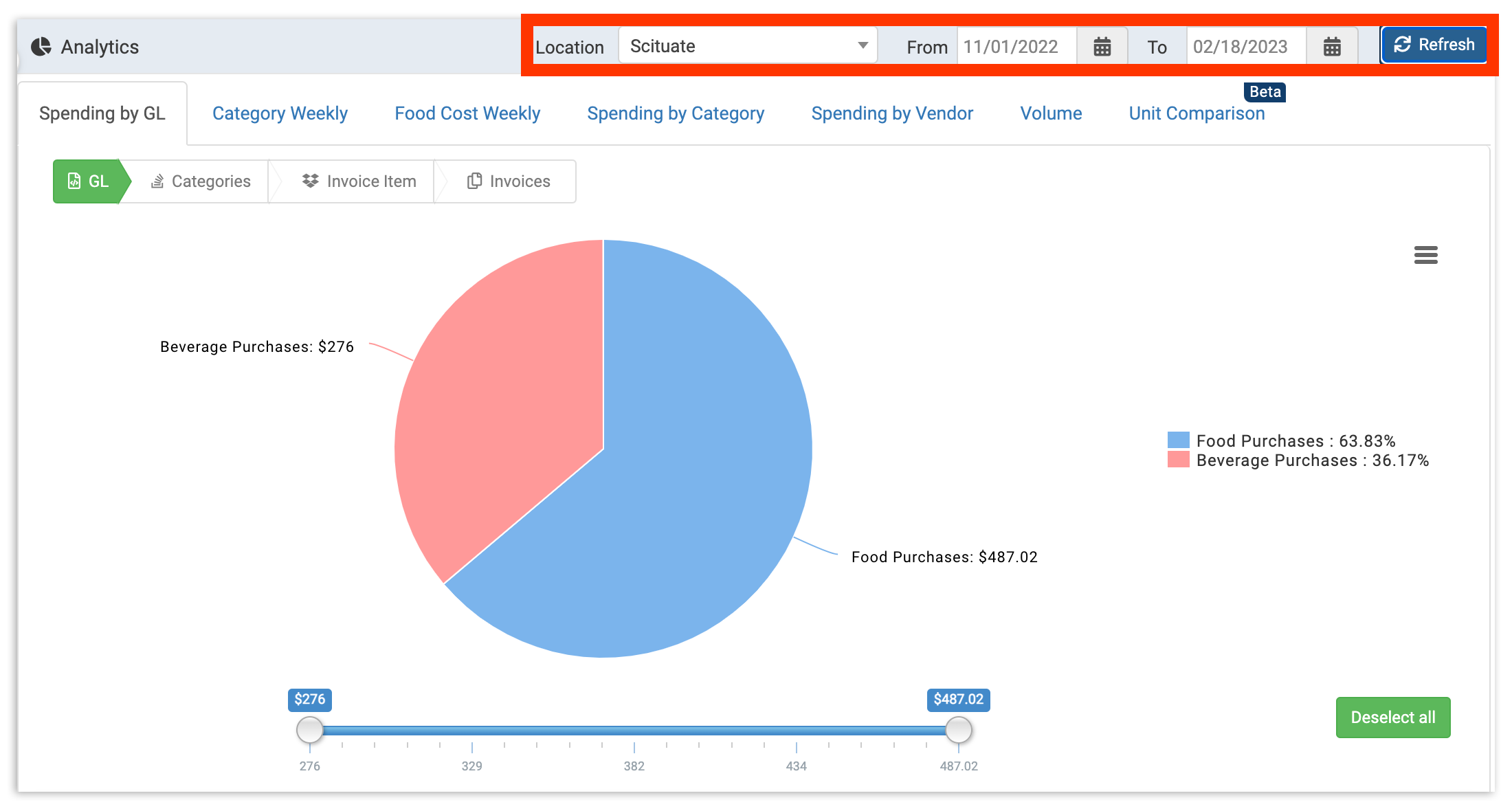
GL View
xtraCHEF analytics can report on spending at multiple layers of detail, allowing you to get an increasingly granular view of your location's spending. The first and most general view is your default GL View. Use this view to get an overall sense of how your different GLs contribute to your overall spending.
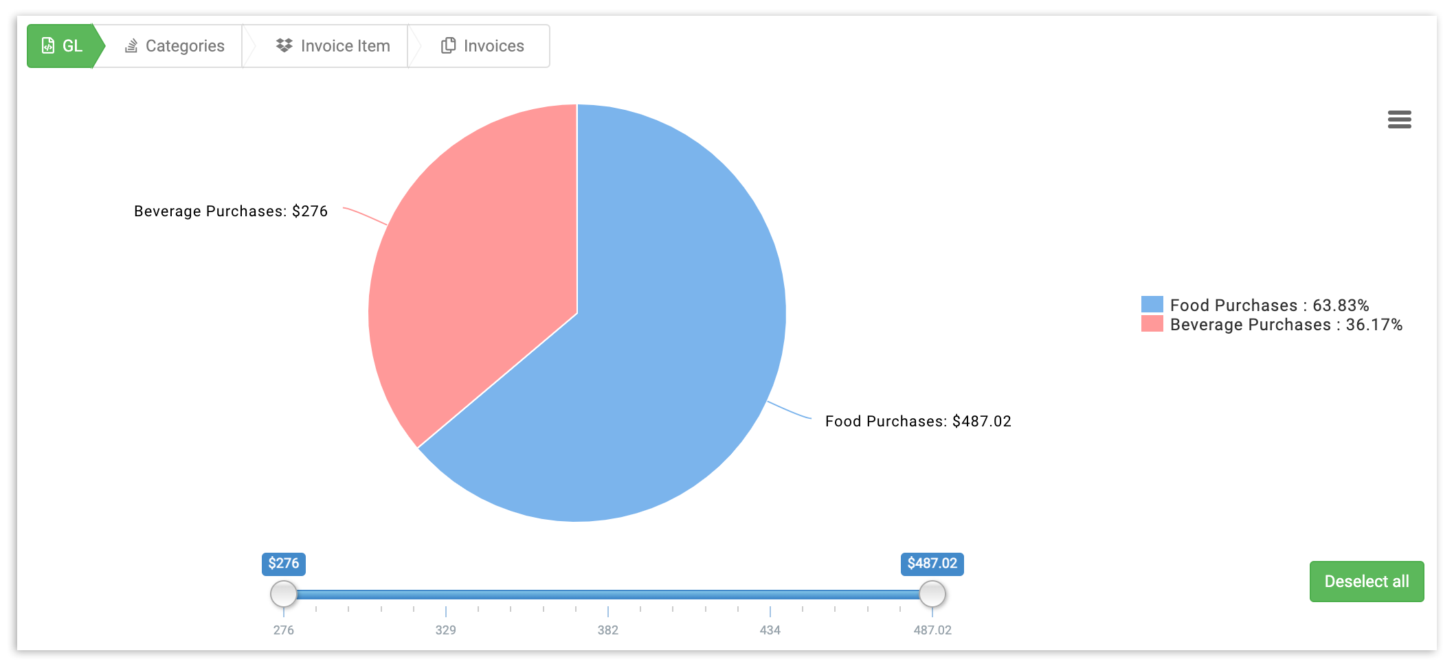
Want to narrow your results? On the right of the pie chart, you'll see a listing of all GL codes. Select a GL code to remove it from your pie chart and table. If you have a lot of GL codes, you may prefer to select the Deselect All button, then re-add the GL codes you'd like to include.
You can also adjust your results to include only a certain spending threshold or range. To do this, simply adjust the slider under the pie chart. This will remove any GLs that don't meet your spending criteria.
Categories View
To get more specific details on your spending, select any GL. You can do this either by selecting that GL's portion of the pie chart, or you can select the GL on the table. You'll be taken to the Categories view for that particular GL code.
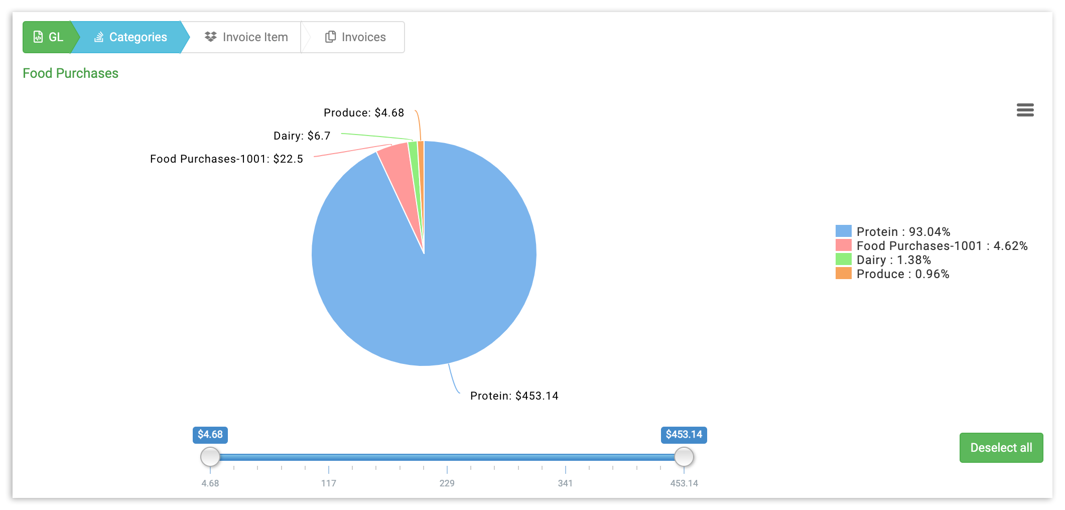
Categories view breaks down your GL into sections, allowing you to understand how your spending impacts your overall GL results. To adjust your results, you can deselect categories from the right side of the pie chart, or adjust the spending slider underneath it.
Invoice Item View
Ready to get even deeper into your data? Select any category (either in the pie chart or table) to get a list of all the individual invoice items in the category itself. This gives you item-level insights into the exact cost of your invoice items.
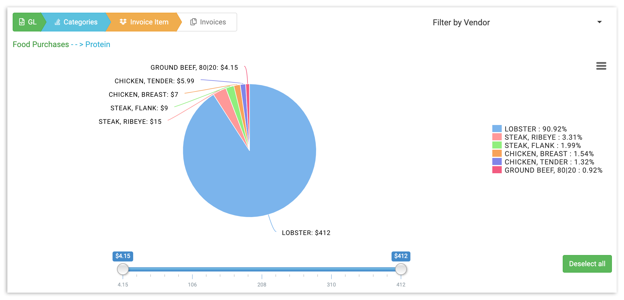
As in the other views, you can specify the exact categories and price(s) you want to see by either selecting the invoice item (or choosing Deselect All) to the right of the pie chart, or by adjusting the price slider underneath it.
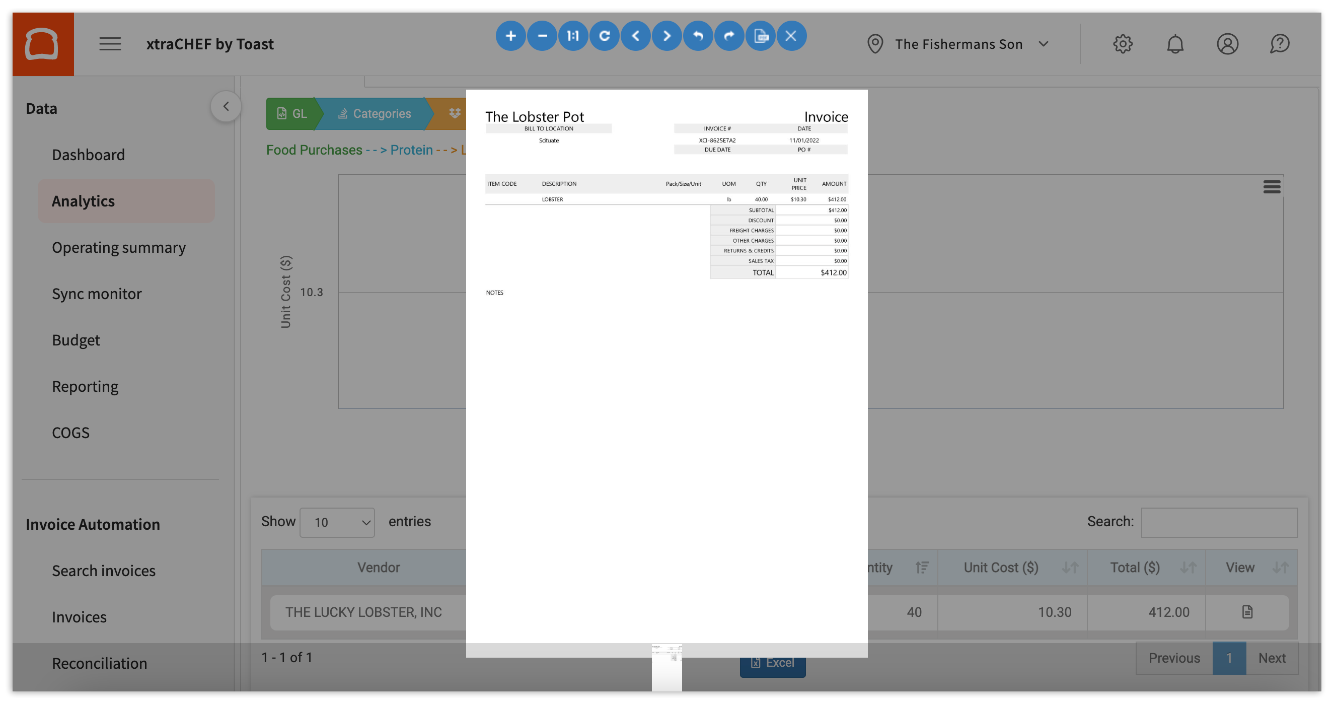
Invoices
Does something look off? Or, do you just want to double check any spending? Select any invoice item to pull up a timeline of when you've purchased it, complete with your originally scanned or uploaded invoices for cross reference.
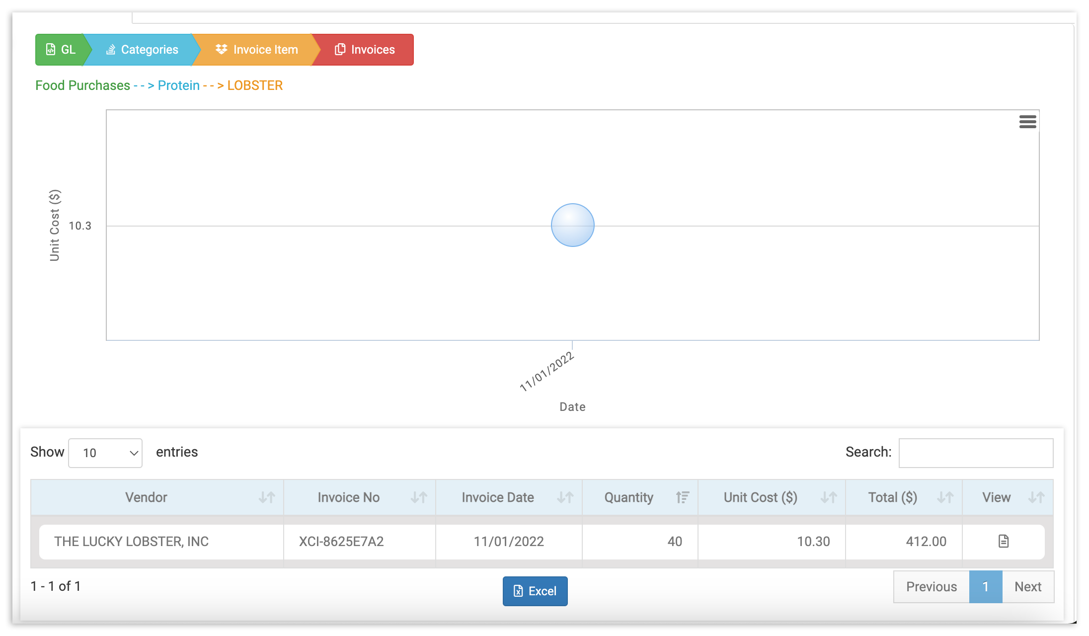
Select a data point on your invoice timeline or an invoice from the table below to pull up the exact invoice that informed your results.