翻译仅供参考。您与 Toast 签署的任何法律协议(包括但不限于《商户协议》和《终端用户许可协议》),其订立语言可能不同于以上页面所使用的语言,无论是否提供本页面其他语言的译文,均应以您所签署的协议条款为准
xtraCHEF:开始使用类别每周分析
上次更新时间:2026年4月8日 10:05
了解在哪里找到您的类别每周支出分析以及数据的含义。
类别每周摘要
您的类别每周分析为您提供了每周支出的概览和详细数据。让我们探索如何访问您的类别每周分析以及在哪里找到所需的信息。
- 要开始,首先导航到xtraCHEF左侧导航中的分析选项卡。在这里,选择类别每周选项卡。
- 此数据集的摘要视图将会显示。此视图显示按类别划分的本月支出。
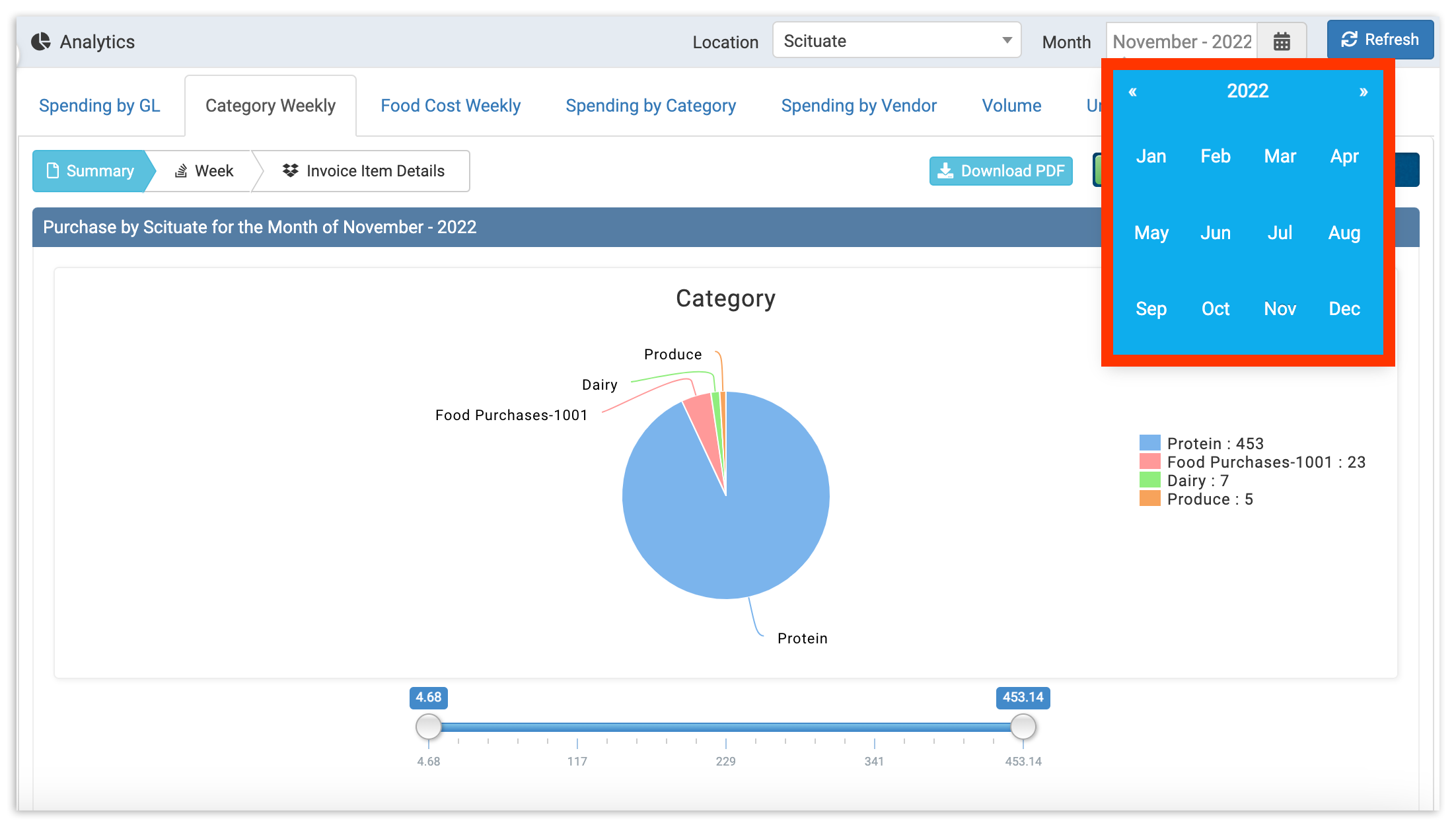
- 默认情况下,类别每周将显示当前的月份/周。但是,您可以通过选择右上角的日历图标来更改日期范围以查看以前的月份。
- 默认情况下,类别每周将显示当前的月份/周。但是,您可以通过选择右上角的日历图标来更改日期范围以查看以前的月份。
- 选择新日期范围后,选择刷新。您还可以通过期间至今或本月至今(您的默认视图)使用右上角的滑块在视图之间切换。
摘要视图
该摘要视图包含一个饼图和表格,帮助您了解组织每月支出最多的地方。使用饼图快速获取支出主要类别的视觉概览。
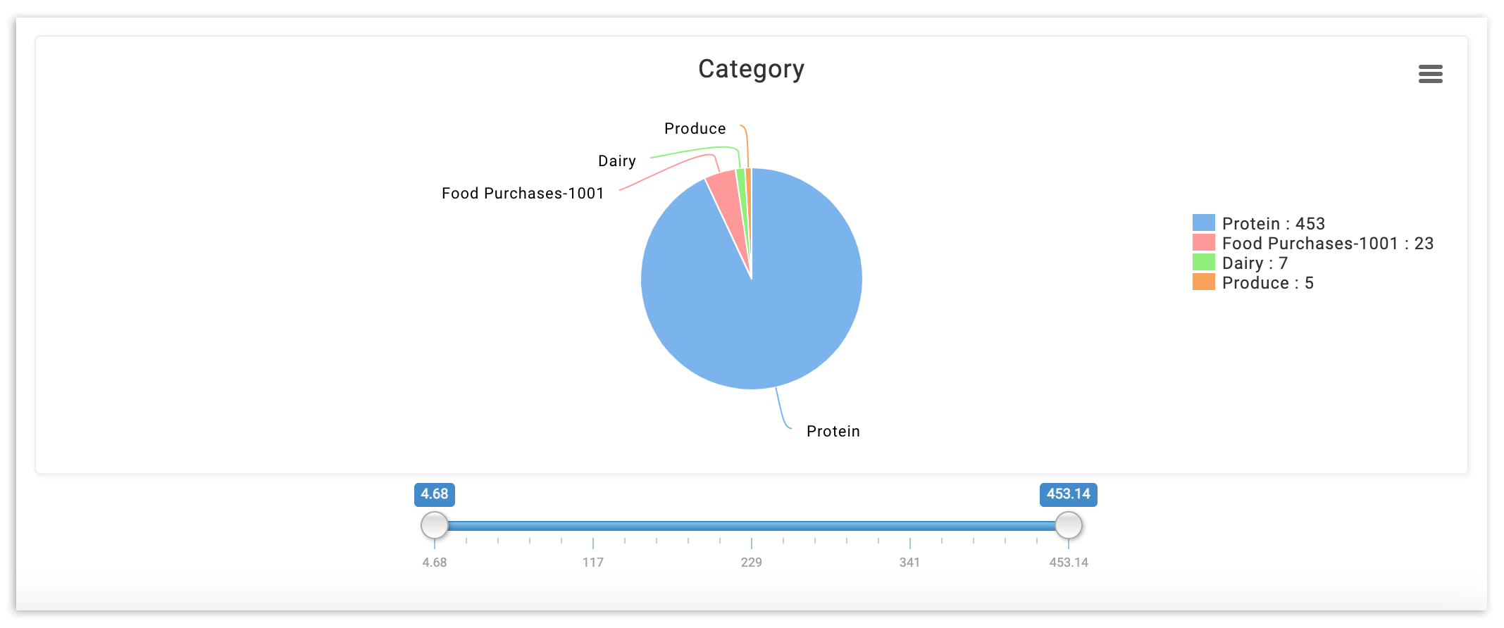
此图表将在每周更新,随着新数据在本月中添加。要查看已完成月份的图表,请从右上角的日期选择器中选择您想查看的月份,然后选择刷新。
在饼图下方,您会找到一个电子表格,其中包含按类别划分的每周支出。
要深入了解任何一周的数据,只需选择该周的标题列。 这将使您从摘要视图切换到周视图。您还可以选择周标题和图标。
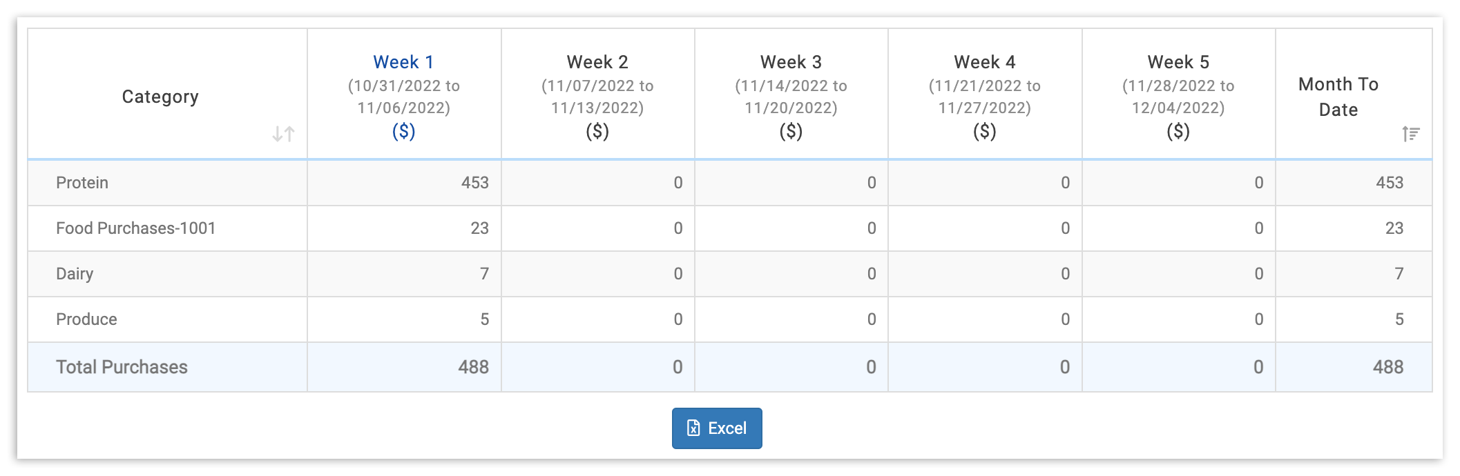
周视图
在周视图中,您会发现按类别和供应商划分的每日费用。
要进一步深入,选择日期或供应商以显示发票项目详细信息视图。
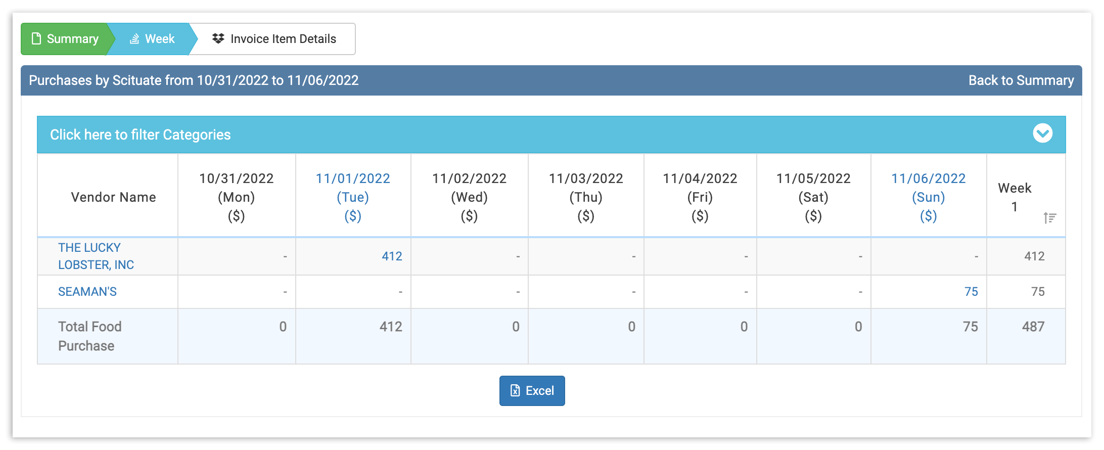
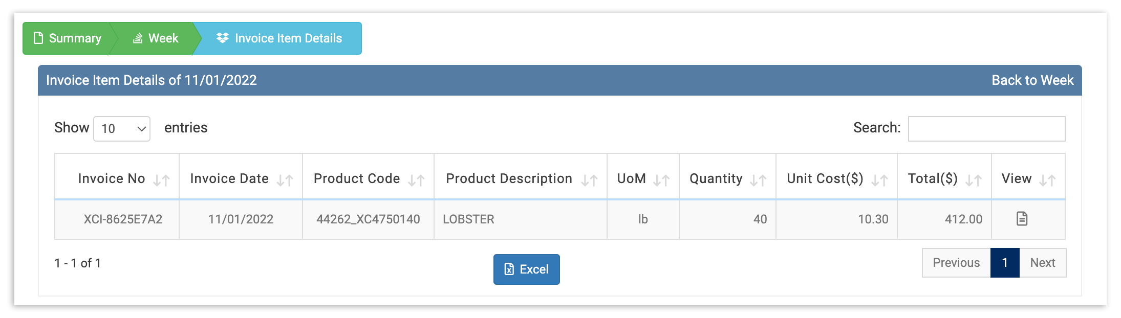
发票项目详细信息视图
您的发票项目详细信息视图将提供特定日期的支出完整、详细的分解。要查看任何发票,只需在视图列中选择查看图标。
这将使您了解与特定供应商或日期相关的每周支出,具体取决于您的选择。使用您的类别每周支出数据来跟踪支出随时间的变化,了解哪些是您的高价项目,并实时掌握任何令人担忧的趋势。