Toast Benchmarking: Multi-Unit Group Overview
Last updated: Apr 8, 2026, 10:17 AM
Learn how the Toast Benchmarking group overview can help multi-unit restaurant groups compare key metrics across locations and benchmark against industry peers.
- Toast Benchmarking Group Overview Report
- Filter the Benchmarking Group Overview
- Group Overview Data
- Additional Resources
Toast Benchmarking Group Overview Report
The Toast Benchmarking Group overview report allows multi-unit restaurants to analyze key benchmarking metrics across all locations at once, including net sales, average check size, orders, and sales per labor hour. This report can help you identify top- and bottom-performing stores by each metric, and gives you insight into how each location’s performance compares to industry peers in your market.
To access this report, you must have the following permissions:
- 4.20 Benchmarking Access
- 4.21 Benchmarking Restaurant Group Report Access
In Toast Web, navigate to Reports > Benchmarking > Group overview to get started.
This report is exclusive to Benchmarking Essentials, a feature of the Restaurant Management suite. To learn more, see Toast Suites Overview.
Filter the Benchmarking Group Overview
At the top of the Toast Benchmarking Group overview report, you’ll see two filters that impact all of the data displayed in the report:
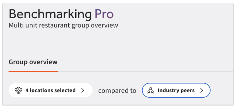
- Your selected locations are the restaurants in your multi-unit group that you want to compare. You can view all restaurants in your multi-unit group, or narrow your results to specific locations.
- Your comparison peer group (“industry peers” in the screenshot above) is determined by your selected traits. Based on your selections below, we will do our best to find similar restaurants close to each of your locations. We recommend adding as many criteria as possible to ensure we have big enough samples for each location. When you edit your peer group, you can customize the following:
- Service model: Full Service, Quick Service, or Other.
- Cuisine/Type. Restaurants in the peer group will have a significant portion of their menu or sales mix aligned with these labels, determined by Toast’s machine learning models.
- Price range, based on average ticket size over the last six months. These ranges are calculated after removing extreme values and represent approximate averages, though they may vary slightly.
- Alcohol sales range. Select a range for alcohol sales percentage based on the last six months of sales data. These ranges are approximate and help you find peer groups with a similar product mix—whether they primarily sell food or a higher proportion of alcohol.
If you make any changes to these filters, select Apply changes to refresh the data on your report. After customizing your peer group, you’ll see the option to Save as default filter or Reset to default peer group if desired. Resetting to default will change your peer group to Toast's recommended default.
In addition to these overall filters, you’ll see additional drop-downs above each of the charts on the Group overview page that allow you to select your date range, comparison date range, ordering channels (On premise, First party online, Third party online), and performance metric (Net sales, Order volume, Sales per labor hour, Avg. check size). Select Apply after making any changes.
Benchmarking Group Overview Data
At the top of the Group overview page, you’ll see top-level group values for Net sales, Order volume, Avg. check size, and Sales per labor hour for your selected time range and comparison period. Select the down arrow next to any value to see the averages for your best and worst performing locations.
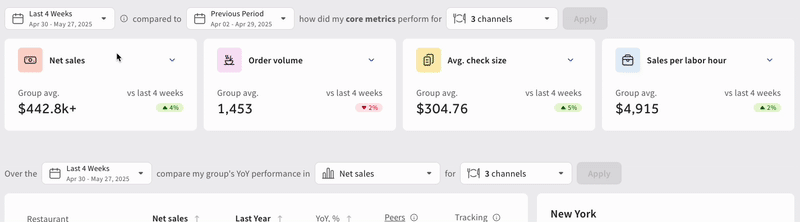
Below these metrics will be a table showing each restaurant in your selected group with their restaurant performance and year-over-year (YoY) trends compared to the industry peer group you selected. You can use the drop-down menus at the top of the chart to view different performance metrics and filter to different ordering channels as desired.
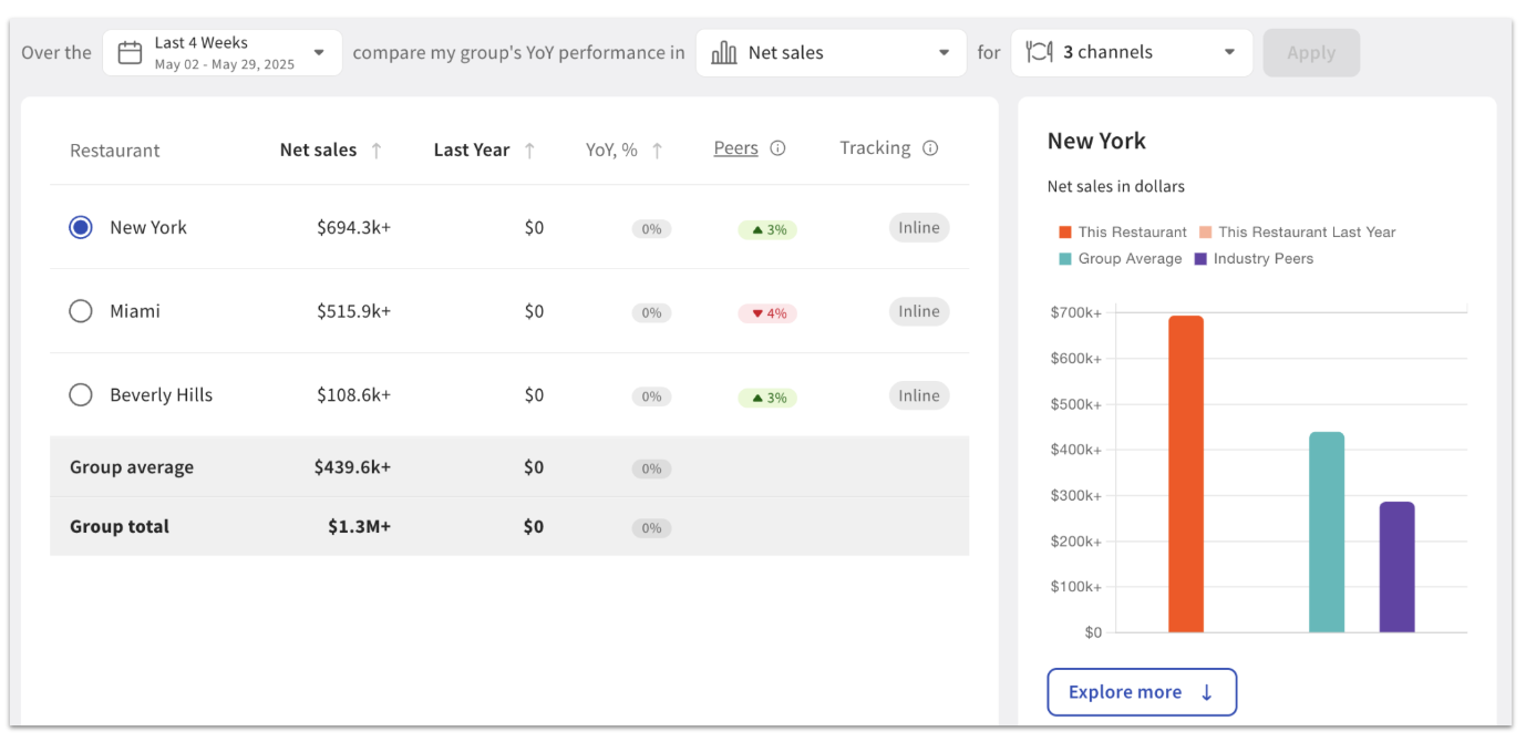
Selecting Explore more will take you to a chart that shows a detailed breakdown of your selected restaurant’s performance compared to the group average and to your industry peer group based on the filters you chose.
Additional Resources for Benchmarking